Hi all! I am Rahul Jaiswal with Open@RIT. We have been working with Prof. Steven Yi on developing community guidelines and resources to streamline contributions and community engagement. While we are new to the Csound community, many of our recommendations come from popular open source theory such as Nadia Eghbal’s Working in Public book. These suggestions are simply recommendations from us and we hope to start some productive conversations around how we can create a better and more effective Csound community.
As a designer I was asked by Prof. Yi to re-evaluate the design of the website and look at potential issues when it comes to information architecture and general usability. These are an initial phase and can be iterated upon but I felt that it might be useful to any community members who wish to contribute to and improve upon the existing Csound website.
Information Architecture
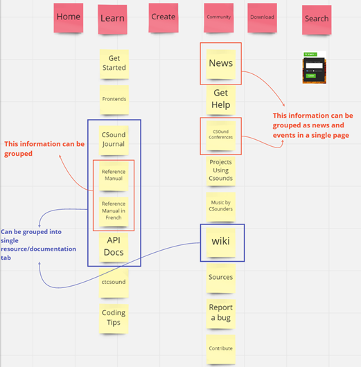
Below is the current CSound Site Navigation (Figure 1) and some suggestions that could be implemented for making the navigation more effective.
-
“Reference Manual” and “Reference Manual in French” can be combined into a single page instead of two where the user can toggle between the languages(English/French).
-
All the Manual can be shown on a single page called “Resource/Documentation.” So, pages like “CSound Journal,” “Reference Manual,” “API Docs,” wiki, etc., can go in a single page where they were displayed using a sub nav/ Panel on the “Resource/Documentation” page.
-
“News” and “Csound Conferences” can be displayed on a single page too called “News & events” because the conference page does not have a lot of information by itself.
-
Search option in the Menu is not doing the search operation. Instead, it is taking us to the empty Google page.
Figure 1 : Information architecture of CSOUND Website.