Hi all! I am Rahul Jaiswal with Open@RIT. We have been working with Prof. Steven Yi on developing community guidelines and resources to streamline contributions and community engagement. While we are new to the Csound community, many of our recommendations come from popular open-source theory such as Nadia Eghbal’s Working in Public book. These suggestions are simply recommendations from us and we hope to start some productive conversations around how we can create a better and more effective Csound community.
As a designer, I was asked by Prof. Yi to re-evaluate the design of the website and look at potential issues when it comes to information architecture and general usability. These are an initial phase and can be iterated upon but I felt that it might be useful to any community members who wish to contribute to and improve upon the existing Csound website.
1) Inconsistent “sideNav” bar
Some pages have “links,” while some pages have “Content” on the side nav. This might confuse the user while navigating through the website. So, either all the pages can have just Contents on the side nav bar or just a link section on the side nave bar.
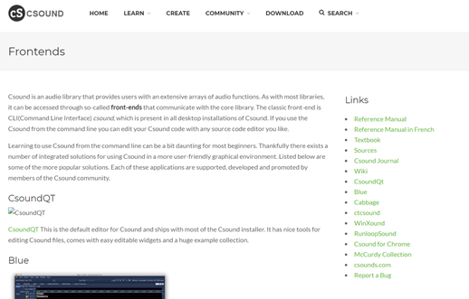
Figure 1: Links on the SideNav Bar.
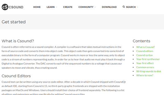
Figure 2: Contents on the SideNav Bar.
2) External links opening in the current tab.
Some links on the Csound website are external links. When clicked on these links, these are opening in the current tab, which does not allow the user to go back to the CSound website. Thus, making it hard for the user to navigate. So, making these external links open in a new tab can fix this usability issue.
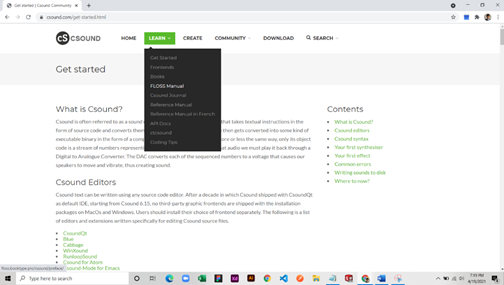
Figure 4: User clicks on the “Floss Manual” option when on “csound.com”.
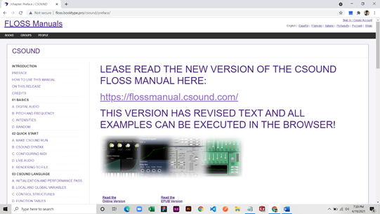
Figure 5: User redirected to “floss. book type. pro” after clicking on “Floss Manual”.
3) Missing Breadcrumbs on the nested pages.
Breadcrumbs allow the user to identify the path/ hierarchy/location of the page. Csound website does not have this kind of information anywhere on the website while navigation to different pages making it not very accessible to the users when looking for the nested pages.
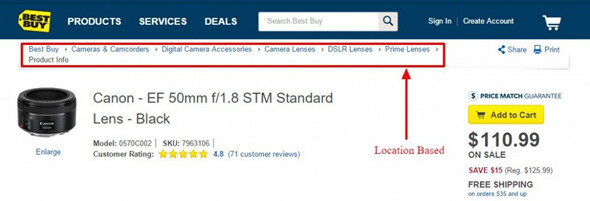
Figure 6: Example showing the use of breadcrumbs in a website.
4) Missing information on the Contribute page.
Contribute Page on the Csound website have some blank content under headings “Community” and “Documentation.”
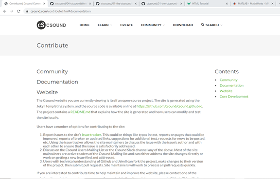
Figure 7 : Missing contents under “community” and “documentation” heading.
5) User should be able to see Menu/Nav options on long pages.
When the user scrolls down in Csound website on few pages which have long content, the top navigation menu also gets scrolled along, making the user unable to see the top nav. The ”Go to top Arrow” button on the bottom right corner of the screen is not very visible to the users. Thus, “Freezing” the top nav while scrolling can solve these issues.
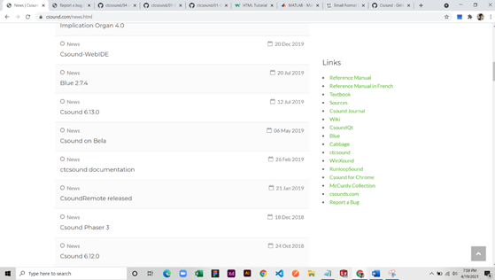
Figure 8: Top nav bar not visible while scrolling, "scroll to top” button at the bottom right corner not visible clearly.
6) Latest news section on the home page.
The “latest news” section on the home page has news from “Dec 22, 2017” to “Dec 29, 2020”. Showing only the recent/important news could make it concise.
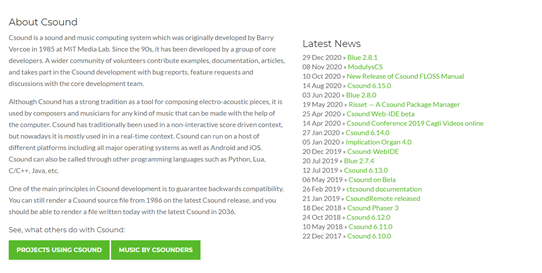
Figure 9: Latest new section on Home page.
7) Side nav options does not matches with the content.
Styling of some “subheadings” makes it looks like a “heading.” This confuses the user as these headings are not visible on the content menu on the right navbar. Thus either making a smaller heading for the subheadings or making the main headings bold can solve this issue.
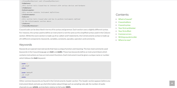
Figure 10: Heading on Learn page does not match with the content menu.
8) Images do not have alt text and captions.
Images used on the Csound website are not accessible to all the users since these images do not have any “alt text” or any caption under the images.
Figure 11: Images on CSOund website does not have any captions or alt text.